As we continue to bunker down in the new normal age sparked by the coronavirus pandemic, it’s not surprising that many of us feel caught between the devil and the deep blue sea, battling to choose between what we see as two equally nasty courses of action.
It has changed the way we live, work and communicate, and our world is filled with many unknowns that threaten to paralyse us with white-knuckle fear.
Keeping the colour metaphor going, it’s good to be reminded that even in these dark and gloomy times, every cloud has a silver lining.
And in the world of signage and advertising, carefully choosing your messaging, your imagery and the tones employed will go a long way towards keeping you out of the red.
This is particularly pertinent to those in the food, drink and hospitality industries who are currently grappling with a revised business model that has dramatically changed the way they operate.
The cutlery and crockery have been safely stored away, while the chairs and tables are stacked high in a far corner, effectively reducing their businesses to take-away outlets.
But even amid the doom brought on by these challenging and unprecedented times, there are those whose kitchen stoves and ovens remain fired up. The great meals for which they’ve become renowned are still being lovingly prepared and enjoyed by customers both loyal and new.
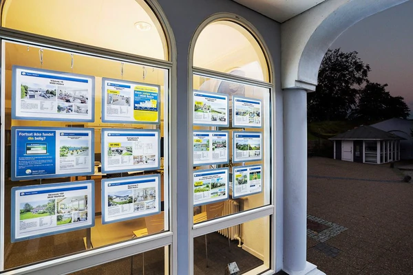
When you dig a little deeper – as I did a week or so back – you find that there’s a common thread to among the key components to their survival: strong and powerful images and messages in their shopfront windows, conveyed in colours that ooze positivity.
Like blues and greens.
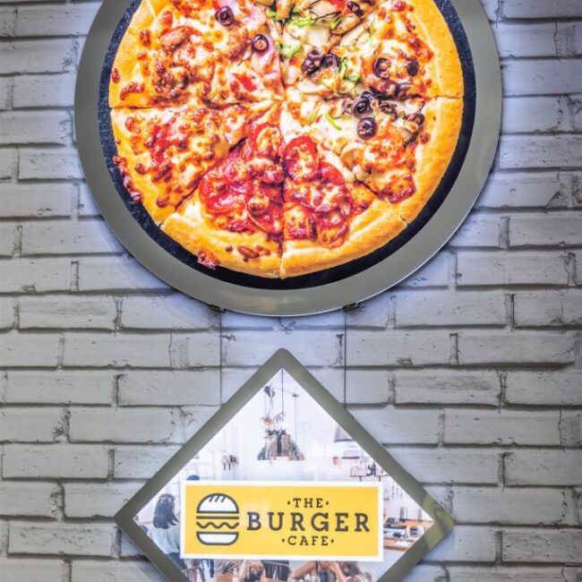
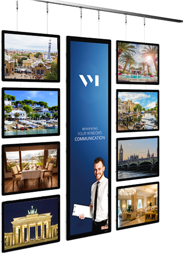
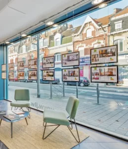
When chatting with a selection of hospitality customers using our VitrineMedia large format static backlit LED screens, they echoed an upbeat message.
They told me many of their customers make a point of saying how effective the screens are in advertising the fact that they are still here, that business goes on and the great meals continue to find their way to home dining room tables, either collected or dropped off by the growing band of food delivery services.
It is no coincidence that their screens are filled with uplifting “we’re open for business” messaging, supported by striking imagery that is powerfully communicated by the backlit LED screens’ cold white light.
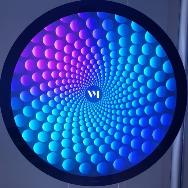
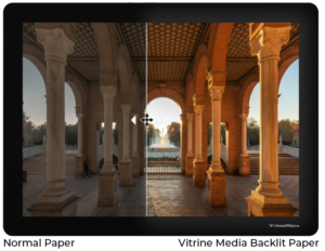
It’s a clear, pure light with documented feel-good properties that are even further enhanced when the visuals have generous splashes of blues and greens.
Psychologists have done a mountain of work in recent times on colours and how they affect our perceptions and behaviours and have arrived at the consensus that blue is associated with, among other things, trust and a sense of calmness and serenity.
Their research further tells us that green exudes feelings of harmony, balance and peace and is the colour we turn to when seeking to soothe our everyday stresses.
So, don’t feel browned off about the current situation. Rather, see this as a red-hot opportunity to light up your windows with powerful blue and green displays and messaging and prepare yourself for a purple patch that’s sure to help you stay in the black!
On that colourful note, stay safe, stay positive and take good care of each other in these surreal times.
Let’s embrace them.








Comments are closed