


Is your storefront making the most? Is it creating the first impression to your potential customers?
Digital signage is now ubiquitous. Digital signage is used by all major industries and businesses to improve marketing and communication. It has changed the game for retail shop owners who use digital signage. It has simplified queue management and instant checkout. Creating appealing digital signage content is one of the major challenges businesses face when deploying digital signage technology. It may appear simple, but it is not.
Customers notice LED signs first, so they should leave a lasting impression that encourages them to return. It’s important to make a good first impression of your sign because we tend to remember it.
The best signs will attract customers with bright colors, graphics, and a clear message and design. These seven basic suggestions will help your sign stand out. Let’s explore how to easily create eye-catching digital signage content.
Determine your resolution and aspect ratio.
Choosing the right resolution and aspect ratio is the first step in creating appealing digital signage content. Imagine showing customers stretched and distorted images on a big screen. It won’t go down well with them. It may harm your brand’s image and popularity. The resolution is the Pixels Per Inch (PPI). The aspect ratio defines the image’s width to height. Most commercial screens are 1080p and 1920*1080 pixels. Let our experts help you to choose the best size according to your requirements.
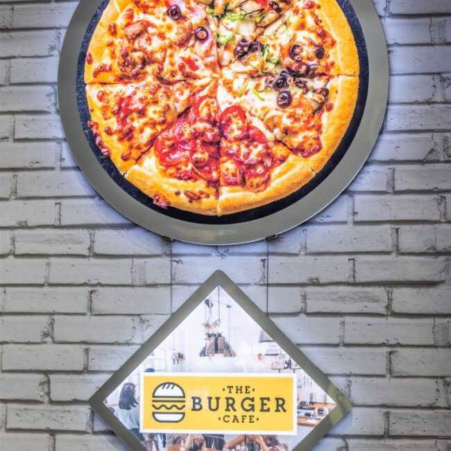
Choose eye-catching images
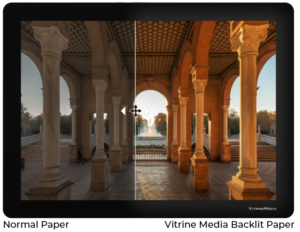
That the human brain can process images nearly 60k times faster than text? It’s not just this. Visual information transmits to the brain 90%. In short, high-quality images on digital signage can change the game. Always choose high-quality, attention-grabbing images. Instead of random websites, use high-quality stock photo libraries. Poor images can imply poor products.
Picking the right font and text style
You may be mistaken in thinking that something so minor can’t improve your digital signage’s performance. Choosing the right font and text style for your digital signage content can make a big difference. The right font style depends on the message you want to send your customers. It depends on the tonality you want to convey. It is advised not to use more than two fonts in a single design. Large text and bold styles improve readability. Keep fonts large to help viewers read from a distance.
Color guide to choosing the right Digital display
Colors have a lot of impacts. Colors have been shown to influence moods, actions, attitudes, and even purchasing decisions. Color psychology is a vast subject that can take up a lot of time. Check out this color psychology cheat sheet for planning your digital signage content.
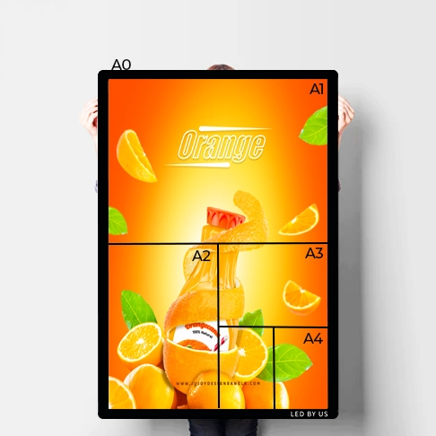
- Yellow- Using yellow as a background color with dark typefaces is very effective. Some people report that it makes them happier, more excited, and more focused.
- Red- Red is the strongest color. Arouses interest, releases adrenaline, and even anger. In addition, it has been shown to boost appetites and food purchases.
- Orange- Orange, like red and yellow, evokes vigor and joy. Orange is a popular color among kids.
- Blue- Most Americans prefer blue to any other color. It soothes and calms, making a brand more relaxed.
- GreenGreen is often linked to growth, wealth, and prosperity. Financial institutions love it.
- Purple- Purple is a color associated with royalty and elegance.
Although NanoLumens displays show white brilliantly, black is used to help text “pop” on dark backgrounds. However, depending on how it’s used, black can have a negative impact on individuals. In general, it is used as a text or accent color rather than a focal point.
Reduce your color palette: Sometimes less is more in digital signage. Use digital signage to quickly communicate a message. Our eyes get confused when too many colors are used. Simplification of the color palette will help viewers find what they are looking for. Making content memorable while using fewer colors is the trick.
However, in general, high contrast between the text and the background is important for easy reading. For easy reading, use black text on a yellow background or white on dark blue.
Stunning full-color graphics draw the reader in. A border and contrasting colors help draw attention to important information, increasing retention and impact.
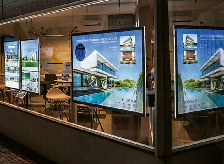
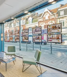
Our start now screens are easy to install and it can be done in seconds and your store is ready to get more traffic is on the go.
Make your point.
Rather than using cursive letters or a font that is difficult to read from a distance, choose a design that emphasizes the letters and makes your message clear. The easiest color combinations to read are yellow text on a black background or black text on a yellow background. Experiment with your company’s color scheme first.
POP IT!!
A good sign should be visible from a distance and stand out from its surroundings. A small sign, a dark background, and light letters make reading the letters easier.
Keep legibility
Ensure clear typestyles and adequate spacing for words and letters. A sign’s success depends on simplicity. Choosing the right font for LED signs can be difficult. In a rut, we either use the same font or choose fonts that aren’t appropriate for the situation.
Finding a typeface that perfectly complements your logo or trademark font can be difficult.
Still undecided? Here are some suggestions for your next project:
- Simple Block: Used for signs that must be read from a distance. Using a more stylish font in such settings will make the text harder to read, requiring it to be larger, reducing available sign space.
- Cursive Script: Never use all-caps fonts, as the results are difficult to read. Use these styles for minor text sections.
- Heavy or fancy fonts should only be used in headlines. Large text passages in them can be difficult to read.
- Fancy Lettering: This type of typography is best used for a logo or a headline.
- Conservative: These fonts work well for body text, lists, and subdued text.
Remember, these are suggestions. It’s okay to be a little wild and shake things up. Keep your customers’ attention by changing the message’s format.
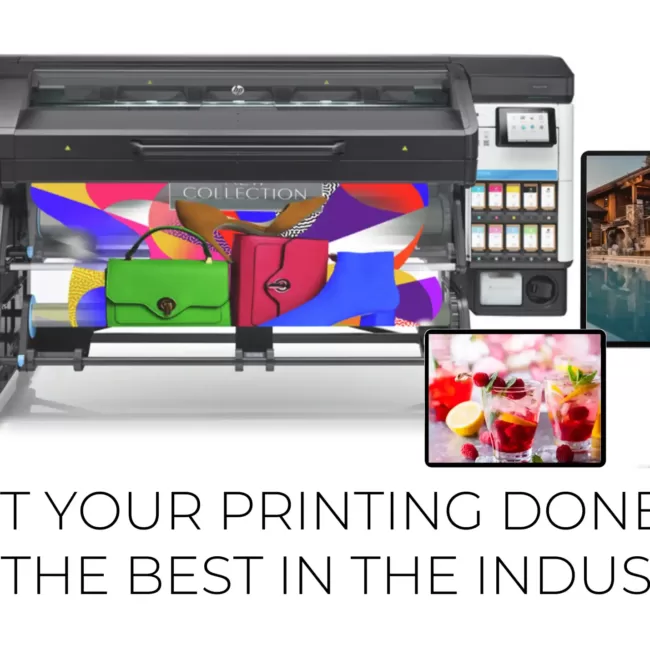
Thinking of adding signage to your business? Businesses who want to connect with their customers can turn to VitrineMedia for a variety of backlit LED products. Also, we provide design, printing, and installation services to make sure your business stands out from the crowd. Contact us today and we can explore all your signage options, so you can make the best choice for your business. Or book a meeting to get a consultation with one of our sign experts.


Comments are closed